Monday, June 27, 2011

Lily The Littlest Angel: "Gets Her Wings" cover

So here's a post on the journey of designing the first book of "Lily The Littlest Angel" written by Elizabeth Pulford. Scholastic commissioned Steve Wells to design the book cover. Steve is based in the UK and he has worked on some books for Scholastic Australia.

So all I have to do is send the illustration to him and he will do all the typography, composition and getting the whole cover file ready for print.
Steve used my initial Lily illustration to try out some directions for Lily's books. Now we are all focusing on what sort of style we want for this series. It is really important to get this right as it sets the "look" for the entire Lily world.

 We liked the sky backdrop so I came up with more suitable Lily in action roughs which will suit the concept better than the standing Lily illustration.
We eventually decided on this flying Lily image.

The editor suggested I try for a more flat colouring technique rather than with brush texture. Maybe it will appeal more to the target audience of modern young girls?
I tried out a few variations of colours.

Then I also tried making her gown look less old-fashioned by adding more details and accessories.

Steve then applied the image onto his background. Are we close yet???

Nooot yet. Tried another version. There were some comments that she was looking too young, so tried making her look sliiightly older here. This image was turned down quickly... But the editors liked the yellow pom poms on her slippers so we decided to take those on board.


In the end we did a full circle and decided to stay with the old-fashioned gown, coloured with painterly brush strokes.....

 ...with yellow pom poms on her slippers! And the cover is finally done! YAY

Saturday, June 25, 2011

Lily The Littlest Angel: Tisa & Book1 cast!

 
Tisa character design first roughs
 
Looking at my new copies of "Lily The littlest Angel" books I can't help noticing that the pictures came out darker than I have intended. Sometimes the nature of the paper makes the ink appear much much darker than what I have drawn on the computer, I feel that this is very frequent in Chapter books (picture books usually use higher quality paper thus the printed images are close to what the designers see on their computer screens)

So I was a bit bummed to see that Tisa's locks look like big lumps of dark hair as all the line details were lost in the dark shadings in the final printed books (this also applies to the black cat Frumplepuss- you can only see his eyes amongst all his dark features!)

Oh well, too late to change anything now. I will have to make the illustrations much lighter from now on!
Tisa final character study

The last character I will be introducing in the first book "Lily get her wings" is Tisa- Lily's room mate. In the first book Tisa appears to be the perfect evil rival by being rather snobby and cold towards Lily. But I feel that she will eventually grow to be Lily's best friend :) Personally I think Tisa is like a mixture of Ron and Draco from Harry Potter.
So there you are. The entire main cast of the first book of Lily! Hope you will grow to enjoy and love them as much as I do! Check out the author, Elizabeth Pulford's page for more updates!

Thursday, June 23, 2011

Lily The Littlest Angel: Mother Angel & Felicity

More sneak peeks of the cast of "Lily the Littlest Angel". See previous posts for other character designs.
Mother Angel is the wise, beautiful and the powerful Angel of Amelia's Angel Academy. I suppose she is equivalent of a principle of the school.
 She has a very tall figure and is strict and powerful yet at the same time very kind and forgiving; almost like a mother figure to all the little angels at the Academy. I wanted to portray these qualities in her design... beauty, strength and kindness.
My two initial sketches were already close to the final design, Just a tweak here and there....
And here she is, Mother Angel!
Felicity also appears in the first book. Being the beautiful senior student, she was very easy to draw. I think pretty characters are easier to draw than ugly yet lovable ones. When I was little I only used to like drawing pretty things, but as I grow older I tend to like drawing characters with a bit of ugliness real-life like flaws and imperfections! In a way it makes them relate more closer to the viewers I think!

Wednesday, June 22, 2011

Lily The Littlest Angel: Angel Mina & Mip Mop, Professor Glumbo & Frumplepuss

Just over a week to go until Lily the Littlest Angel books start showing up in the bookshops!
Elizabeth Pulford has created so many magical characters in these books. I am having so much fun designing and illustrating them. Below are the design sketches for the teachers at the Amelia's Angel Academy, the school Lily attends to learn how to become an angel.

 
As usual I bullet point descriptions in the manuscript before drawing up characters to make sure I'm not missing any vital information. The first sketch for Angel Mina was too old and frail looking. Even though she is one of the oldest Angels in the Academy angels are supposed to age gracefully :)

 Angel Mip Mop is one of my favorite characters. She is the messy chef of the Academy. She turned out more full figured than the initial sketch which I like!

 And here goes my favorite duo, Professor Glumbo and Frumplepuss! The names say it all about these two rather frumpy yet so lovable characters. I quite liked the hunchback in the initial sketches but in the end the professor turned out more upright and rather fashionable looking with his scarf and feather pendant :)

Tuesday, June 21, 2011

Lily The Littlest Angel: Lily Character Design

Just over a week to go until this new series start hitting the book stores!
So here goes another preview, a post on Lily from the new series "Lily the littlest Angel".

When I was given this project from Scholastic I was handed with both manuscript for the first two books. As I read the stories I bullet pointed characteristics of Lily mentioned in the manuscript and came up with a bunch of potential character design.


Few days later I receive comments and feedback from my lovely editor, the senior editor and the author, Elizabeth Pulford. 
After shuffling through the feedback I came up with a more refined design. Still trying to figure out how the trainer wings strap on her.


I was getting close. After making her look a slightly older we settled on the design below.
I then move onto refining the colour palette of Lily. The below palette was taken straight from the manuscript, "Rhubarb red hair", "green eyes" and "blue gown".
 Applying those colours to the line work and....
WALLA! Lily, we meet at last!
Only a slight change was made from there. Somewhere along the process from this point to drawing up the cover illustration I forgot to add the little curly hair around her ears (you can see that Lily on the covers on the previous post doesn't have the curly "sideburns" ). I actually quite liked the little curls, oh well ... what can I do now, I've already finished illustrating the third book!

 Oh yes, I also played around with different colour combinations for her hair and eyes. But the red hair green eyes combo is a winner! :)

Preview! Lily The Littlest Angel Series


Exciting announcement! Next month will be launch of a brand new series, "Lily the Littlest Angel" published by Scholastic NZ.
This charming new series is written by the Award winning New Zealand writer, Elizabeth Pulford. The first two books "Lily the Littlest Angel gets her wings" and "Lily has a Secret" will hit the book stores around New Zealand and Australia! Exciting!

I think New Zealand schools are lucky as they seem to have the books in their libraries already. The librarian at my school that I work at showed them to me. I was surprised as I only received my copies today! Apparently the students were excited that there were more books illustrated by their "Miss Aki" :)
Arrgh loving my job.

You can get a glimpse of the first chapter of the first book here.
I am having so much fun illustrating the fourth book now, scheduled to be released towards the end of the year. I will be posting more on Lily soon!
In the mean while check out Lily's blog written by Elizabeth Pulford!

Tuesday, June 14, 2011

Billie B Brown- The Little Lie

June is the month for release of the 11th book in Billie B Brown series, "The Little Lie" written by Sally Rippin. As usual I started off with the illustration for the cover. I assumed that we were due for a green cover by now with possibly a yellow logo. I matched her up with pink T shirt and checkered three quarter pants:
Then the designers at Hardie Grant Egmont adjusted the colour scheme and we ended up with a purple cover!


Billie gets herself into a lot of trouble in this book. Even her best friend Jack ends up being not happy with Billie!


 There's a classroom scene where I thought it was a chance to reveal more of Ms Walton as we didn't get to see much of her when she appeared in "The Extra Special Helper". But we decided to get rid of her in the final version... maybe next time Ms Walton!

OH! And one more exciting news!
One of the Billie B Brown books, The Secret Message, was chosen for the Australia's 2011 Get Reading! programme.
Get Reading! is Australia’s largest annual celebration of books and the whole campaign runs from 24 August to 30 September, held in all major cities throughout Australia. The best thing is that I am invited by the organizers to take part in this event with Sally Rippin! Being in New Zealand I haven't really felt all the hype of Billie B Brown, so I just can't wait to meet the whole creative team behind BBB and thank them all for letting me be part of the creation of Billie!

Friday, June 10, 2011

Sparkle Creations June Release Preview: Bicycle Chloe

Today is the release of Bicycle Chloe! Sparkle is giving away this cute stamp to one lucky person, To find out how visit the Sparkle Creations Rubbers Stamp store and follow the instructions!

I love Chloe. She is one of my favorite characters! :) Although she only appears in the form of stamps when I draw her I'm imagine there's a whole story behind her. In my mind Chloe is a living girl, full of character!
I had so much fun colouring her up. Below is my work process! 
Rough

 
Final illustration used for the stamp.


Alice Wertz has made a beautiful card using this stamp! Loving all the details! So cute!


Card made by Alice Wertz

Thursday, June 9, 2011

Sparkle Creations June Release Preview: Cherry Blossom Rin


It's time for a sneak peek at Sparkle Creations Rubber stamps June release!
I had Japanese hakama in mind when illustrating Cherry blossom Rin. Hakamas are a type of kimonos traditionally worn by men. They come in two pieces, top and bottom and the bottom is actually trousers suitable for swordmen and horse riding back in the days. Now these are worn by both sexes. But I drew Rin in a way so that people can colour her in as if she is in a kimono like Shaela has done below.


Shaela Odd has made a beautiful card using this stamp! 
How inspirational! Loving all the patterns!

Be sure to visit the Sparkle Creations Rubber stamp storeSparkle will be giving away a Cherry Blossom Rin to one lucky person! To find out how click here!

Actually I was in a funny bubbly mood when I was colouring Rin up. I remembered where I was when I was working it's original line illustration for the stamp.

A couple of months ago a bunch of my friends and I visited Great Barrier Islands for a rural getaway. Actually at that time we were constantly bombarded by dreadful news about the Christchurch and Japan disasters. Whichever way you turn TV, radio, Internet, people, everyone was talking about the two disasters that it seemed to overwhelm us, we were all craving for a peaceful getaway. Great Barrier Island was perfect, it has a small  population of 852 people, the whole island is powered by generators and solar power, no ATMs, no street light.. reminds me of my childhood.


After a sickening bumpy 4~5 hour ferry ride ( normally 3 hours) we arrived at the island wharf.


Our 20min drive to our bach (beach house) was very memorable, we only came across maybe 4 people (including the dude at a stranded little shop who kindly gave us directions) and drove past close to 100 boats and dinghies. Do people here own more than one boat each?

Our bach was a bit dated but clean and homely. The fridge and the oven was powered by gas, other than that the rest of the house ran on one solar powered panel which meant no TV, hairdryers, hair straighteners, microwave, computer/laptop etc. This meant that there was no chance for us to turn on the TV and see more sad news, no Internet and mobile access helped that too. Plus we had access to canoes, beaches, bushes and for those rainy days, lots of board games, cards and a huge 5000piece jigsaw puzzle!
The weather wasn't ideal, mixture of rain, heavy rain and spots of sunshines. One night we ran out of solar power when the sun went down. Us girls enjoyed working on the jigsaw puzzle in candle light, until my hair caught on fire! It wasn't too bad, except losing part of my fringe and those uncontrollable fluffs on top of my head. The boys didn't notice any of the power cut or my head on fire incident as they were enjoying their "man time" fishing.

Daytime was spent on the beach, walks, searching for hot springs, catching fish/seashells, cooking, eating, conserving energy and playing card games and jigsaw. :)
 Eating in the dark (candle light)

 Visiting beaches

 Admiring houses with more solar panels.. later walking past the house and seeing its lights on and kids playing games on computer and watching TV. 
 Kaimoana for the day

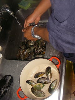
 Collected Mussels during the morning walk. Cleaning them to make garlic butter mussels!

 Loving these signs all over the island!


 On a long walk to find the local natural hot springs

 Sadly hot spring water has been washed away by the rain...


 cleaning out the contents of the fridge; steak, fish, ham, sausages, salad

I always take my work with me if I leave my studio for more than a day, I spent some time inking up... Cherry Blossom Rin!
 Cherry blossom Rin rough

 Me working at the bach table. 

Close up

 Final image used for the stamp!